Jury Drawing

Have you ever wondered why you are picked to be on jury duty? Most people make all sorts of sounds at the thought of being selected.  I took a drawing approach.

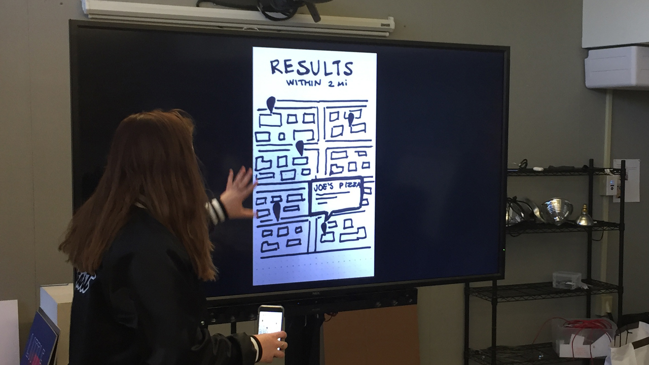
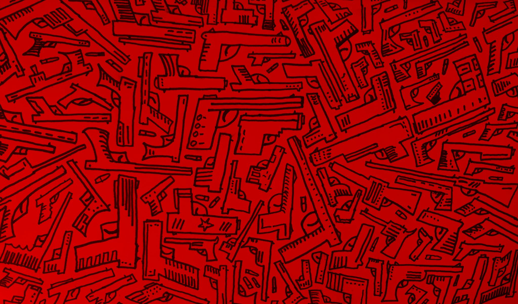
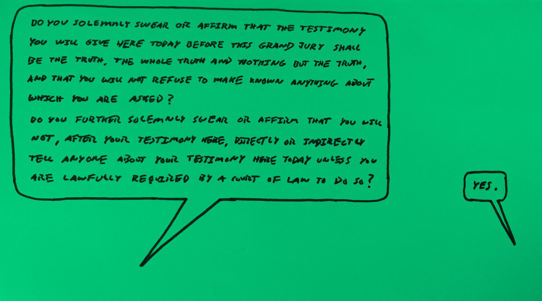
Some years back I was selected as one of ten or so jury members to serve a three-month term on a grand jury. We met three days a week all day and herd cases from every walk of life. This was not the typical jury for one case, rather a tome of potential cases with 10 to 15 per day. Our task was to hear basics of each case and vote on if it had merit to continue on. To pass the time in between and to record impressions of the experiences I did a number of drawings. They were quick reactions to stories told, nothing specific. It was a way to pass the time between hearing cases.

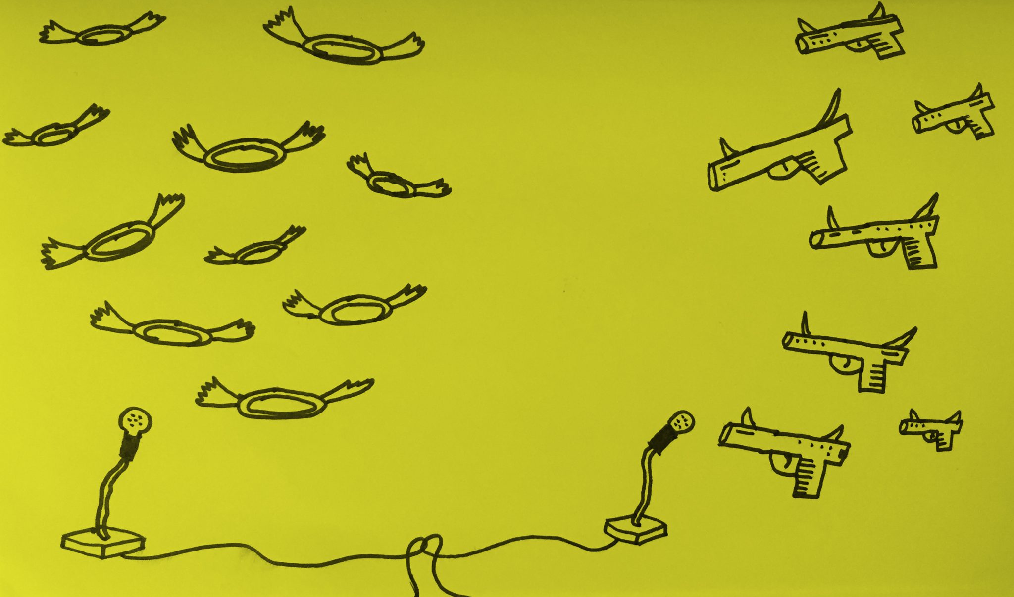
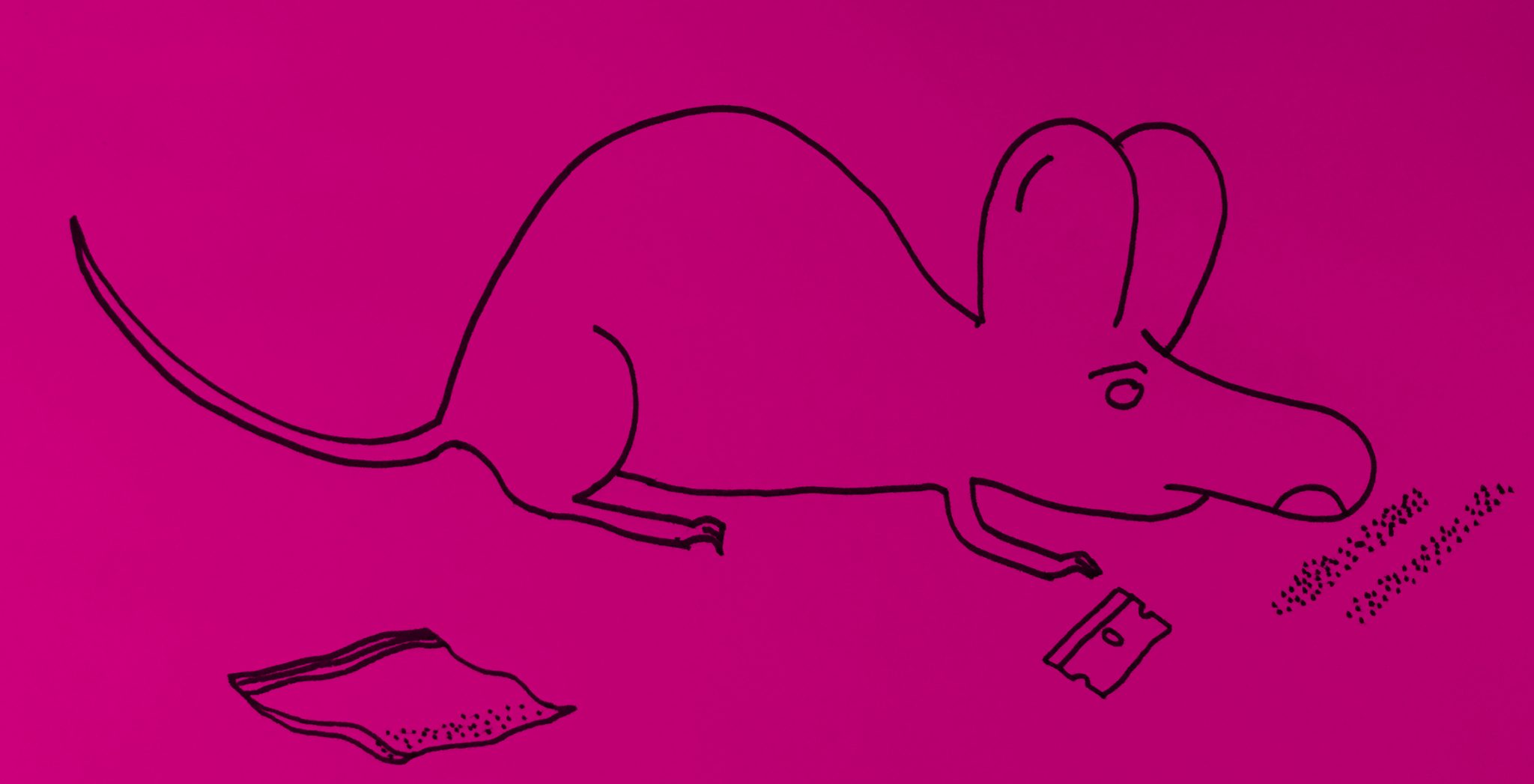
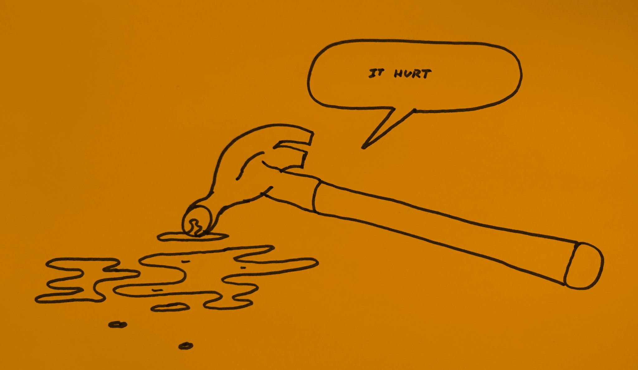
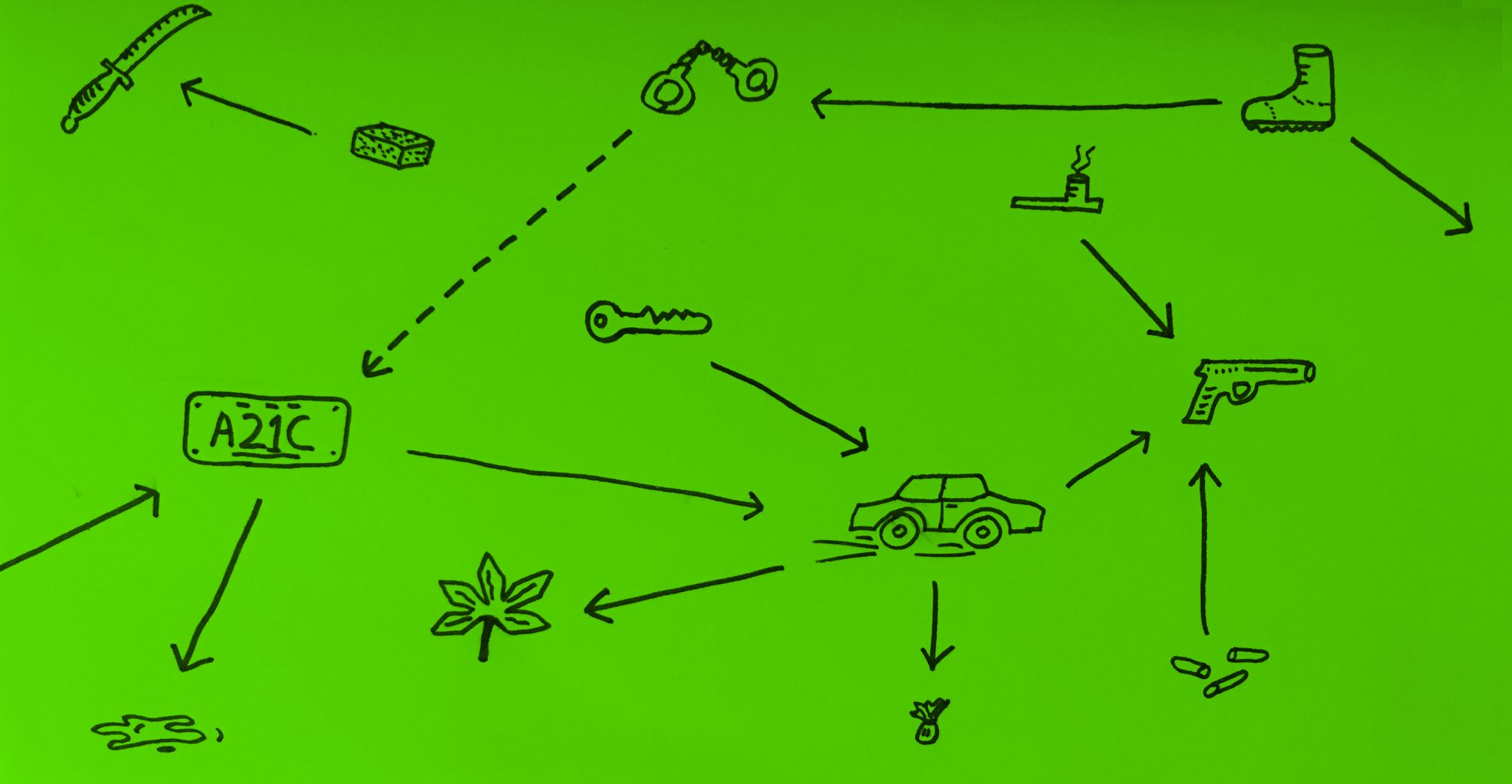
We herd from all walks of life, police, mothers, fathers, sons, daughters, prosecutors, grandmothers, witnesses, victims and many others. It was a revealing cross section of the town I live in and how life is such a challenge. Drugs, abuse, guns, love and hate, you name it, it was all there, each day, over and over. Guns were everywhere.

After a while I became almost numb to the stories, at other times I would cry on my way home, not knowing what to do, wanting to change what was going on. I imagined the “system” would solve the issues and I was one small cog in a machine that is our judicial process at that moment. I thought my role as a citizen was complete because I was a part of this effort and I could simply move on. Surprisingly I have sat on other cases beyond this experience and I think I am not done, nor will it ever be for the foreseeable future. There is something about me that gets me on a jury duty. I have that “nice guy” syndrome.

I have since struggled with how or if I should share my jury journey. I am still torn and not quite sure of its totality or relevance. I imagine it will be many years before I can process my learnings. As a designer, I appreciate the power of visuals from where ever they come. The images I share here are a selection from my sketchbook with some added color that I hope will give pause for how others might reflect their jury experience.

Since those days much has transpired in the town I call home, St. Louis Missouri. The struggle for justice continues, ever needing us to revisit scars, to heal, and re-heal wounds inflicted yet again. It seems we learn little from the past, but the challenges are deep and need attention over generations. If I can say anything of this experience and the countless others I am witnessing living here is that we must engage as much as possible in the civic and political structure of our cities. As a “creative” I must do more to use visual language to reflect what is, but also impact and support change, to persistently engage with our civic duty and challenges, and hopefully help to reframe and “design” a better ecosystem over time.

If you are ever asked to be on a jury, step up and seize the opportunity. Make something from your experience. Do a drawings. Reflect upon your learnings and come out the other side with some insights to build on. At the very least it will help you empathize with the challenges we face and possibly help find solutions for them. Best of luck!

Paper to Pixel: Prototyping Workshop

I recently facilitated a two-hour workshop about how to prototype on paper and then transitioning those ideas to a phone app experience. It was amazing what everyone came up with in such a short time, from interviewing each other, brainstorming ideas, selecting a direction to wire frame, then linking the images up and sharing among the teams.

The prompt I used was allergies. I had teams of two interview each other using and empathy map to gather insights. The goal is to ask open ended questions about how the interviewee may have experience being with someone that has an allergy, in social situations, or observing interactions in a restaurant. Most of us know of someone or have had an experience to reflect upon that can give us a starting point to build on.

We then all came together to share key insights. These were particular pain points that came up in the interviews. People would write an insight down then post it up on the wall and say it out loud to share with the group. The group quickly identified themes from all the ideas. Once doing this for about ten minutes we began exploring possible solutions that solved some the the leading themes. With only eight people in the workshops we had a large number of insights and then about twenty solution directions to explore.

Once each team selected an idea to build out further they used phone templates to draw a series of wire frames of what the app might do to solve the particular situation. What might the core screen contain and what is the basic navigation. Some focused on a specific feature or set of interaction steps.  I then had teams download the POP by Marvel app which is a simple tool for linking up the images.

They next took pictures of their wire frames, then link them up so that one could click through a sequence as if in a real app. It is a tangible method that allows others to understand your idea and thus give constructive feedback. The fact that it is very low fidelity is also a great way to receive feedback because people understand that it is only an exploration.

This was a quick way to demonstrate that one can generate many of ideas and test them quickly and cheaply. All this took about two hours and all had something to share out at the end. A ton more ideation and refinement needs to go into this, but it is an example of how one can move quickly to create something to share and receive feedback on. It is also just a fun way to spend an afternoon!

Want my slide deck? Check it out at this link.

If you are interested in doing your own prototyping, try these resources:
POP by Marvel https://marvelapp.com/pop/
Balsamic Mockups https://balsamiq.com/
Adobe XD https://www.adobe.com/products/xd.html
Sketch https://www.sketchapp.com/

A big thank you to AIGA WashU Student Group for hosting this workshop.
Intro image of event poster by Lauren Fox.

Service Design Studio

In spring of 2017 I taught an intro studio about service design. Students were juniors and seniors in communication design. The first project explored mapping experiences and the second team based project explored mental health in rural communities. We did design research, blueprinting, journey mapping, wire frames, design development, and many other steps to arrive at proposed solutions. The class partnered with the Center for Innovation at BJC Healthcare and the students did final presentation to them and invited guests. One of the projects, called “OK Cards” was considered for testing with BJC’s clients in the field.

The full syllabus and project descriptions are at this link. Some of the class work is at this link.

++++++++++++++++
More about the studio from the syllabus description:

Services design is an interdisciplinary approach for creating useful, usable and desirable experiences between service providers and customers. Services have always been around: hospitality, transportation, health, restaurants, tourism and many others. At a macro level it is a strategic and systems level way of thinking that shares many of the tools used in “design thinking.” Today designers from many disciplines are engaging “services” at various touch-points where people interact with a service; advocating for people and creating designed artifacts that support successful experiences.

By the end of this course you will be familiar and comfortable with bringing high-level concepts into actionable visual solutions based on system level observations. The path is fraught with ambiguity, but you will become comfortable with using research methods to identify opportunities and insights. A human-centered approach will develop your sense of empathy and support visual form making skills that in turn create compelling service design experiences.

The class assumes that you are an advance communication designer with a grasp of typography, color, composition on screen and print. We will not discuss these in a fundamental way, but rather flex and practice our visual development competencies in the context of visualizing system level information and designing key touch points in a service experience. The class seeks to leverage your visual skills in tandem with strategic thinking needed to see whole systems. We will use “mapping” to visualize service experiences and opportunities that in turn identify the best channels such as print, web, mobile, or environments, to meet a customer’s needs. While you may design a print communication solutions we will seek to see where in the service experience it lives and why it is relevant.

There are many processes and “toolkits” for services design. All have slight differences and nuances, but generally follow a path of defining the problem, exploring through research methods, generating ideas through mapping and visuals, and realizing and testing your ideas. How deep we go into each of these will depend on the project scope, the make-up of your team, and a number of moving and unpredictable variables. The first short project is self-generated and second team based, applied with partners.

Why this course in this program? As a “designistraition” Communication Design (graphic design and illustration) program in the College of Art, you are all deeply engaged in and developing your skills in visual form. You tell stories and communicate ideas that are understood, insightful and enlightening in visual forms. This class gives you the opportunity to use those skills while imagining larger services type systems and applications. How does your [fill in with app, book, environment] really resonate with a larger system in which it lives? Does that thing you made really resonate and work in the services experience? Do the people using the tool really understand it as one element in the experience continuum? Do we really need it? While we cannot “test” the experience in full, we will aspire to come as close as possible.

Service Design: Mapping Experiences

In the Spring of 2017 I taught course called Service Design to undergraduate communication design students. The first project was titled “Mapping Experiences” and was intended to introduce student to the idea of using a service design research methods to map an experience while at the same time making a compelling poster project. As artifacts for communication I have observed the landscape of journey maps and service blueprints often feeling complex in part due to how they are created. Post-it notes and scribbles dominate how we make them to begin the process. They are good for getting the ideas out on paper and moving information around. However, taking these posters to another level in which they become tools for organizational understanding and communication can improve their impact and usefulness.

Above are some sample of the student posters by Olivia Alchek, Wade Johnson, Alex Hammarskjold, Lydia Kim, and Kelly Tsao.

Below is the project description.

Mapping Experiences

Overview

A map is a common tool used by many disciplines. Service designers use maps as strategic tools for understanding large complex systems, the objects people use in them, the steps people take through the system and the people that provided services along way. Often these maps capture a variety of emotional and or decision point data that informs what might solve specific or sequences of the challenges or opportunity. Journey maps and blueprints are two methods. Maps are also created to support interaction between a consumer and a service such as to simply guide a person from point A to B. At opposite ends of the spectrum, from strategic overviews to daily tools, each has a different context to address and goals to meet. The process for creating them can also vary in depth and breadth.

For this short project, you will select an experience of your choice to make a map that communicates at multiple levels. It will error on the side of a strategic map, yet with the graphic fidelity that makes it quickly understandable and compelling as a visual. Readings provide a foundation for various types of maps and structures. While many of the examples may be “simple” they offer levels and structures for exploring a service experience that is key in the understanding phase of a project. Your challenge is to select the appropriate visual structure and create a visually compelling map that communicates at multiple levels and suggest potential solutions. The topic should be one you can have quick access to people that can give you insights about the topic area.

Prompts

The following are various prompts; however, you are free to select an experience you are interested in. Do not dwell a great deal on the topic and once you select it you must stick to it.

  • Planning for post college life in a place you have never been to.
  • Exploring the zoo with five people you sort of know.
  • Going to the super market to buy food for a vegetarian party with four friends.
  • Thinking about, going to, ordering and eating your favorite food.
  • Traveling to the St. Louis Arch and back.
  • Navigating the career counseling experience.
  • Going to visit a friend at the hospital and navigating various spaces.
  • Managing your class registration and course selections over college life.

Readings

  • Mapping Experiences by Jim Kalback pg. 1-44
  • This is Service Design Thinking by Stickdorn & Schneider pg. 28-51 and 68-87
  • Linn Vizard, There’s a Map For That! The Designer’s Cartography of Complexity: https://vimeo.com/190602711
  • Phil Robinson, Being Scrappy: Service Design Meet Rapid Growth: https://vimeo.com/190606863
  • Touchpoint, Vol 1, No 1:  What is Service Design?
  • A Guide to Service Blueprinting by Nick Remis and the Adaptive Path Team at Capital One
  • Hugh Dubberly & Shelley Evenson, “Designing for Service: Creating an Experience Advantage,” (2010)
  • The Difference Between a Product and a Service – As Told With Hammers by Eric Flowers
  • The difference between a journey map and a service blueprint by Megan Erin Miller and Erik Flowers

Thanks:
Thank you to Christine Stavridis for helping out with this class. She was a visiting designer, alum of the program, and terrific partner in supporting the content for this new class. The posters in the slides above are from the following students in order of presentation: Olivia Alchek, Wade Johnson, Alex Hammarskjold, Lydia Kim, and Kelly Tsao. These are only a few of the many created.

Design Thinking: A Human Centered Approach

I have facilitated a number of workshops called “Design Thinking: A Human Centered Approach” developed by an arts organization called COCAbiz. The companies I have worked with include accounting, marketing, health insurance, schools, banks, and agriculture. While I facilitate design, the workshops are couched in a broader leadership and innovation framework led by COCAbiz’s Steve Knight. What is fascinating is how teams work together and what they can create in just a couple hours.

The workshop has a five-step approach. In teams of four members explore feeling empathy, defining insights, ideating, prototyping and testing ideas. I give a little history of design thinking as popularized by IDEO and others, share personal case studies then we launch into two hours of making. The prompt they work on is “How might we create a wow that works sitting experience for Steve?” The final goal is to create a chair out of one sheet of cardboard. Teams ask Steve questions to learn to empathize and identify insights they can ideate on to define key features they might explore. Prototyping with small sheets of paper then allows them to use their hands to make shapes and structures that in turn facilitate discussion and comparison as they narrow the direction. They then test one agreed upon idea, or a combination of prototypes, by building one chair with a large sheet of cardboard. No glue or tape is allowed.

Having done a number of these now I have some insights:

Gaining empathy is hard work.
There is much discussion about “empathy” in design fields and many others. The basic idea is that getting to know your user the better you can create products and services for them. Ethnography is another method to gain empathy given that what people say is not always what they do, so observation is critical. Marketers use surveys or focus groups; others use large data sets to see trends and build from there. Designers though use small sample sizes to learn from and build off those insights combined with design trends in the market. Great insights always come from asking question that illicit a story beyond what your are trying to directly solve. Questions such as recalling early memories of comfort or places that invoked warmth and security are some that can inform a deeper understanding of people, and thus inform a more empathetic direction in the product.

Prototyping makes you think and talk critically.
Using one’s hands to make something forces exploration and is a form of thinking. What is fascinating to observe from groups of people that do not make physical things every day is how much conversation little pieces of paper in the form of chairs can generate. Describing how something works and why it will meet the user’s needs becomes real when seeing it, even if seemingly little half blobs of a chair. It generates debate and having many options forces comparison, which in turn helps identify key features that meet a user’s needs. The more prototypes the more teams can decide what to keep and what to toss. Often times we make the predictable, but by having many option on the table we start to see elements that build with others to create novel options.

Testing in small ways builds risk aversion.
“Fail faster, succeed sooner” attributed to David Kelly of IDEO is a core design idea used by many entrepreneurs. Entrepreneurs I think have a high innate tolerance for risk while designers I think do it in very small increments in order minimize the sense of risk over the entire process.  A designers constant looping and testing helps form confidence in the final solution through incremental steps. When the workshop participants arrive at the finish line and chairs are lined up to test holding ten pounds, which is part of the challenge, the fear of failure I think is somewhat masked by having prototypes of many possibilities. In the end, with many colleagues presenting options, there is also the sense that one will win. From there they can keep iterating to build an ideal chair for Steve if they keep going for more rounds. And as Kelly might say, they have gained some creative confidence in the process.

What is good design?


This past fall I did a presentation to students from around the country that were attending the Archhacks HealthTeck hackathon at Washington University in St. Louis. It was the second day when many of the teams were deep into production mode, had a decent lack of sleep, and were in the home stretch to submit their work. A tough crowed! The title of my talk, selected by the event organizers, was “What is good design?” Challenging question and one I am not often asked, nor have thought to really test. Anyone can check out the annual awards from likes of AIGA, Print, Communication Arts or IXDA and many others to see the who’s who of awardees from the industry. But it is not often, in a thirty-minute presentation we make a stab a really articulating good design.

I decided to provide a balance of big picture thinking combined with the basics of hierarchy, contrast, harmony, as well as nitty gritty of typography, composition, and color. All matter at certain points in the design process. For the strategic side, I combined a 3D model adapted from Richard Grefé with Humantific’s four levels of design (pg 19-23). The graphic depicts the makers of artifacts in the lower left then moving to the conceivers and strategists that use design for larger systems level interventions in the upper right. What is important about design in a broad sense is that there is this continuum from the artifacts to the strategic, from the micro to the macro, and often they work in tandem going back and forth in a constant dance that reinforces each other. For emerging entrepreneurs and creatives in the audience this was my attempt to say that design and the methods of design have a large role in creating valuable products and services at both ends of the spectrum. I peppered the talk with industry examples and even dissected the New York Time website to demonstrate the value of a grid systems. A recent project I think demonstrated the best example was the rebranding of Docdoc (pg 61-62). The re-brand is a demonstration of a changing target audience, a more mature strategy and a clarity of message through the simplification of color, image and type. My parting visual point to all was that ever line counts, how thick or thin, its color, etc. You have to make deliberate choices and the sum of them either results in a clunky overly complex set of visuals and technology we can not navigate, or a clear graphics we understand and travel through because extraneous information is eliminated.

At the end the day, I go back to classic Steve Jobs line that sums of good design: “Design is not just what it looks like and feels like. Design is how it works.” Take a look at the presentation deck and drop me a line. Would love to hear what you think.

PDF Presentation Deck

Graphic Design 101 @ Middle School

16-10-24-design101

I spent an hour today talking to five students at a middle school about graphic design. We were preparing to embark on designing their year book. I went into the conversation sharing a few books about design that I love, such as Ellen Lupton’s Graphic Design: The new Basics and some AIGA annuals. I decided not to do a slide show, but rather to draw out my talking points on sheets of paper in from of them as I shared ideas. I talked about hierarchy, contrast in scale, texture, type, line, etc. I would ask them to comment on my pencil sketches as to which elements on the page they found more appealing and why. I asked them to list all the ways in which hierarchy could be achieved, and they promptly listed over a dozen ways. I was amazed! My college level students in basic design classes often cannot do articulate the same ideas. I continued to talk through my thumbnail sketches of grids, margins, gutters, and general strategies of theme and variation for compositions in a sequential narrative. Again they seemed to get it and point out strategies for making a compelling story. We discussed the section of a year book and I ask them to develop a few spreads in ten minutes that express some concept they thought might be compelling. The sections included athletics, arts, staff, and others. Again they worked quickly and we had time to do a quick critique in the last ten minutes. Once again they were articulate and I think they realized the having a “drawing” in front of them to talk through made all the difference. While many were busy multitasking on their phones, I managed to get them to focus and share their ideas and give each other constructive critique. Wow!

What did I learn? That you can teach a ton about graphic design in one hour to middle school kids. I am not sure they fully absorbed it all, but if my own twelve-year-old daughter is any gauge of this age, they are all sponges able to absorb far more then we give them credit for at times, even if they are bouncing back and forth on their digital devices.

What do I think they learned? We will see next class. I asked them to come back with a type face example that they really love that we might use in the year book. I brought a book all about type design that had tons of examples. One of the students asked towards the end if she could take a look at it. It was one of those moments when you watch a student looking at a book and wonder if this is a turning point for them, a type designer in the making. I am sure she had no idea that there are people out there that make a living out of just designing type faces.

What can you do? Share your practice with a middle school kids. Chances are they have not been exposed to your specific discipline in your unique view, and even if they have, you will just be amazed by their ability to take it all in.

Insight Combination

insight-combination

Insight combination is a “a method of building on established design patterns in order to create initial design ideas” and is typically used at the synthesis phase of a project after some initial research. I have run this exercise a few times with limited success. However, in my most recent class called Interaction Design: Understand Health, I ran it with what I would call a seamless process that resulted in students generating a great amount of ideas to build upon. The exercise was developed by Jon Kolko (at least this is the only person I can find linked to it) and you check out the deck he uses at ac4d at this link. I peppered my talk with some health related projects such as PillPack that I think exemplify ideas that blend new technology in ways that produce really novel solutions.

The project I have students working as a warm up this semester is to explore allergies. I gave them each an allergy from the top eight and had them live with it for a week. A bit of empathy experiences to have them learn how others live with health challenges. A stumbling block I find for many students is simply coming up with an idea to pursue after some initial ideas. How does one turn some contextual research into an idea to develop further can be a challenge. By the end of this exercise they had all come up with ideas that each would advance into storyboards and initial wireframes of the idea. If you want to try out the method, follow Jon’s slide deck and have fun! I highly recommend it.

Interaction Design

IxD

I have taught a class about interaction design for the past few years. It is about making stuff, not history, though we do talk about some brief key moments. Before launching in I ask students to define the term. Here are some definitions they have:

“Interaction design considers the user to be the most important factor. The user is continually considered and consulted throughout the process.” Emma

“Interaction design is a category of design that focuses on the user and looks specifically at improving the interaction between the user and interface, product, environment, most often in the context of digital interfaces.” Elise

“Interaction design is an approach to design that prioritizes a human centered approach to a solution. The result of the design process would be tailored and specific to the users of the design objects, idea or service.” Andrew

“Interaction design is functional and aesthetic design with the goal of the optimal user experience.” Monika

“Interaction design takes usability as its first rule, all decision made take into account the experience of the those who must interact with the work.” Chris

All of these have elements of the definition yet take a more expansive view of interaction design. Some focus on people’s interaction with a computer or technology, but others consider the entire system with the user as a key player in determining success. The Interaction Design Association defines it as:

“Interaction Design (IxD) defines the structure and behavior of interactive systems. Interaction designers strive to create meaningful relationships between people and the products and services that they use, from computers to mobile devices to appliances and beyond.”

It is a relative young and emerging field from a historical writing standpoint, but much like graphic design, industrial design or illustration there is a long history of work once one really starts looking. What I think is unique about the field is that many see the person at the center of solving the challenge. Much like a Human-Centered Design process, interaction design does the same in really looking at the person(s), their context and the end goals. The solution, be it an interface, device or object, is in the service of the persons. While there may be tangible solutions, there are also intangible ones to consider. In addressing both side I think we come closer to appreciating the complexity of how humans interact with and through designed artifacts and systems. Many times it is exploring the intangible elements of the interface that make the overall experience stronger.

Here is an abbreviated reading list if you are interested in pursuing more ideas and methods.

Greenberg, S., Carpendale, S., Marquardt, N., & Buxton, B. (2011). Sketching User Experiences: The Workbook. Amsterdam ; Boston: Morgan Kaufmann.
Hinman, R. (2012). The Mobile Frontier: A Guide for Designing Mobile Experiences. Brooklyn, N.Y: Rosenfeld Media.
Lupton, E. (2014). Type on Screen: A Critical Guide for Designers, Writers, Developers, and Students. New York: Princeton Architectural Press.
Pannafino, J. (2012). Interdisciplinary Interaction Design: A Visual Guide to Basic Theories, Models and Ideas for Thinking and Designing for Interactive Web Design and Digital Device Experiences. Assiduous Publishing.
Pratt, A., & Nunes, J. (2012). Interactive Design: An Introduction to the Theory and Application of User-centered Design. Beverly, MA: Rockport Publishers.
Saffer, D. (2010). Designing for interaction creating innovative applications and devices (2nd ed). Berkeley, CA: New Riders.
Weinschenk, S. (2011). 100 Things Every Designer Needs to Know About People (1 edition). Berkeley, CA: New Riders.

And if you are interested in perusing some great examples, check out the IxDA awards.

Contextual Research Methods

opportunity-map72dpi

Research in the design profession has many methods and outputs. Some clients require and value a research and synthesis process before a design is considered, while others want an experts design direction. As a practicing designer, design researcher, design educator, and design manager, I have become ever more appreciative of a strong research methodology and process to inform opportunities. Undergraduate design school rooted one in the foundations of visual literacy and form to support print, branding or environmental graphic design projects when in practice. With a strong foundation in hierarchy, form and message development I have delivered solutions appropriate to a range of target audiences. However, these were often limited in scope of audience understanding or engagement. As projects become larger and more complex, a strong contextual research process can be used to truly understand an audience or culture that can then inform appropriate strategies for designing messaging, tools or systems.

A project with colleagues Amber Benson and Jason Spinks demonstrates how deep observations and contextual inquiry of letterpress practices and cultures can shed light on new opportunities. For the work each of us selected a press in our respective city and began with fly-on-the wall observations. We developed interview questionnaires and spent many hours embedded in the process of letterpress culture, sometimes taking up the actual making of printed work or even attending workshops and events. This contextual research (often also called ethnography) was a deep dive into the power of being present and deeply observing, listening and capturing every detail of the project.

The fifteen-week process resulted in an opportunity map. The map was titled “Letterpress Culture: Engendering Sustainability” and describes the life cycle of learning the craft of letterpress and what motivates individuals to continue on a path to passion. We identified key steps, from initiation in to the culture, operation of the business, integration into the community, then contributing to profession and finally continuation of the culture to passion and sharing of the practice. Each step was supported by key insights from our interviews. As a collaborative project in three cities we were able to identify similarities across all that resulted in a unified understanding of the culture. The map is in some ways a path for those potentially exploring the practice but also a visualization for further opportunities to advance or engage with the practice of letterpress printing.

Project Blog
Download PDF of Map
Project Video