This past fall I did a presentation to students from around the country that were attending the Archhacks HealthTeck hackathon at Washington University in St. Louis. It was the second day when many of the teams were deep into production mode, had a decent lack of sleep, and were in the home stretch to submit their work. A tough crowed! The title of my talk, selected by the event organizers, was “What is good design?” Challenging question and one I am not often asked, nor have thought to really test. Anyone can check out the annual awards from likes of AIGA, Print, Communication Arts or IXDA and many others to see the who’s who of awardees from the industry. But it is not often, in a thirty-minute presentation we make a stab a really articulating good design.
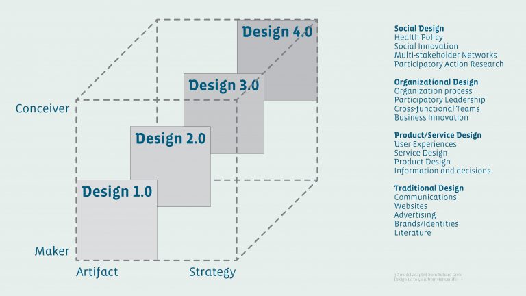
I decided to provide a balance of big picture thinking combined with the basics of hierarchy, contrast, harmony, as well as nitty gritty of typography, composition, and color. All matter at certain points in the design process. For the strategic side, I combined a 3D model adapted from Richard Grefé with Humantific’s four levels of design (pg 19-23). The graphic depicts the makers of artifacts in the lower left then moving to the conceivers and strategists that use design for larger systems level interventions in the upper right. What is important about design in a broad sense is that there is this continuum from the artifacts to the strategic, from the micro to the macro, and often they work in tandem going back and forth in a constant dance that reinforces each other. For emerging entrepreneurs and creatives in the audience this was my attempt to say that design and the methods of design have a large role in creating valuable products and services at both ends of the spectrum. I peppered the talk with industry examples and even dissected the New York Time website to demonstrate the value of a grid systems. A recent project I think demonstrated the best example was the rebranding of Docdoc (pg 61-62). The re-brand is a demonstration of a changing target audience, a more mature strategy and a clarity of message through the simplification of color, image and type. My parting visual point to all was that ever line counts, how thick or thin, its color, etc. You have to make deliberate choices and the sum of them either results in a clunky overly complex set of visuals and technology we can not navigate, or a clear graphics we understand and travel through because extraneous information is eliminated.
At the end the day, I go back to classic Steve Jobs line that sums of good design: “Design is not just what it looks like and feels like. Design is how it works.” Take a look at the presentation deck and drop me a line. Would love to hear what you think.